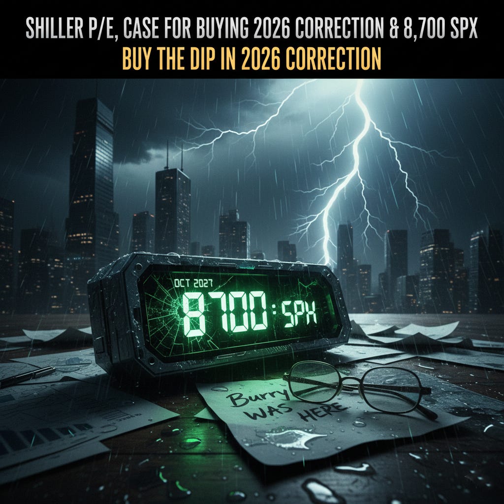
Shiller P/E, Case for buying 2026 correction & 8700 SPX
Buy the Dip in 2026 Correction

Over the past few days, many social media accounts have been pointing out that the Shiller P/E is currently at its second-highest level since the dot-com bubble, suggesting that the current bubble is about to burst. This prompted me to write this article to explain why I believe the bubble will continue for a few more years. We will likely see a sharp correction in 2026 (see my previous article https://substack.com/home/post/p-182115753), but I view that as a likely correction rather than the end of the bubble.
Shiller P/E, also called CAPE (Cyclically Adjusted Price-to-Earnings), is a version of the P/E ratio designed to smooth out short-term economic ups and downs. Instead of relying on only last year’s earnings, it uses the average of inflation-adjusted earnings over the past 10 years (lets call it E10), and then compares today’s stock price (or index level) to that long-term earnings average.

As of late December 2025, the S&P 500 sits near 6,900, carrying a Shiller P/E (CAPE) of 40.7. To the casual observer, these numbers feel lofty, perhaps even overwhelming when the perma-bears and fearmongers label it as 2nd highest since dot com peak. But if you draw a line through history’s most extreme moments of euphoria, the math suggests we aren’t at the ceiling yet. We are simply on schedule.
There is a historical trendline of extremes, a ceiling defined by the two greatest speculative peaks of the last century: September 1929 and December 1999. When you connect those two distinct points in time, you get a slope that projects exactly where the breaking point lies for the modern market.
And according to that line, the S&P 500 isn’t done. The math points to a third peak that is higher, later, and more violent than consensus expects.
The Geometry of a Bubble
The methodology is simple but terrifying. We define our upper bound by connecting:
Peak 1 (Sept 1929): Shiller P/E of 32.6
Peak 2 (Dec 1999): Shiller P/E of 44.19
This creates a trendline that rises slowly over time—about 0.165 valuation points per year. It is a moving target. Every year the market survives without a crash, the “allowable” valuation for a historical peak creeps higher.
If we look at where that line sits today, in late 2025, it demands a Shiller P/E of roughly 48.5. We are currently at 40.7. The gap represents the final leg of the “Melt-Up.”
The Destination: 8,717
Many bullish analysts are calling for S&P 8,000 as the psychological top while perma-bears think the top is already here. The math disagrees with both. 8,000 is merely a waypoint.
Because the trendline is rising, and corporate earnings (E10) are growing, the intersection point is a moving target. I ran the convergence calculations based on the market’s current velocity (valuation expanding at ~4.2 points per year) versus the trendline’s slope.
The curves intersect in Late October 2027.
By that date, the trendline will require a Shiller P/E of 48.8. Assuming the 10-year real earnings average continues its standard growth trajectory, the S&P 500 price required to touch that line is not in the 7000’s or at 8,000. It is about 8,717.
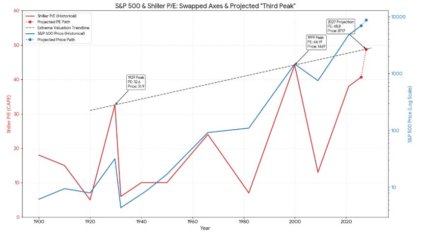
That is the mathematical “Third Peak.” It represents a further ~25% rally from today’s levels—a final, euphoric push that sucks in every last dollar of liquidity on the sidelines. We could trade for anywhere from 6 months to 18 months near the peak before the collapse.
The Gravity of the Mean
The problem with touching an electric fence is that you eventually have to let go. The 1929 and 1999 peaks were not new plateaus; they were summits followed by avalanches.
If the S&P 500 hits 8,717 in late 2027, it will be trading at nearly 3x the historical mean valuation (Shiller P/E of ~17).
What does a “Return to Normal” look like from 8,717?
The Mean Reversion Target: ~3,036
The Implied Drawdown: -65%
A drop to 3,036 would not just erase the gains of the final melt-up. It would wipe out the entire post-2020 rally, returning the index to levels seen during the COVID-19 panic. This is the asymmetry of extreme valuations: the climb is a staircase, but the reversion is a cliff.
The “Rhyme” of the Election Cycle
Why October 2027? Why does the math point there?
It is chilling how well this projection aligns with the US Presidential Election cycle.
The Setup (2026–2027): The third year of a presidential term is historically the strongest. Fiscal stimulus and pro-growth policies are often front-loaded to dress the economy for the upcoming vote. This feeds the run to 8,717.
The Peak (Late 2027/Early 2028): As the election year begins, the market hits “peak optimism.”
The Reset (2029): The 100-year anniversary of the 1929 crash falls exactly one year after the 2028 election.
Historically, the moment of reckoning comes around the election. The 1929 crash happened one year after an election. The 2000 bust began in an election year. The 2008 crisis exploded weeks before an election.
If the projection holds, the next two years will be very bullish with all double digit corrections acting as buy the dip opportunity for bulls, a trap for bears, and a setup for a generation-defining reset in 2029.
The Cassandra Gap: Why Michael Burry is Right (Eventually)
No discussion of market bubbles is complete without mentioning Michael Burry. The man who famously shorted the 2008 housing crisis has recently re-emerged from silence, closing his hedge fund and launching a newsletter to scream into the wind about the “AI Bubble.” He is already placing massive bearish bets against the darlings of this era, like Nvidia and Palantir.
But history teaches us a specific lesson about Burry: he is an exceptional researcher who is almost always two to three years early to the party. He began his “Big Short” in 2005, only to be mocked and sued by his own investors for two long years before the world finally collapsed in 2008. If the “Burry Clock” is ticking again today in late 2025, it aligns with terrifying precision with the math we’ve discussed. Being early feels the same as being wrong, until the moment the trendline is touched. If Burry is sounding the alarm now, he is likely providing us with the exact lead time needed to watch this final, two-year melt-up to 8,700 before the mathematical destiny of the Third Peak finally arrives.
My Views: Beyond the Fear-Mongering
I wrote this article to cut through the noise of those who use the Shiller P/E as a weapon of fear. While the ratio is at historic extremes, a better understanding of its past shows us that “expensive” does not mean “imminent crash.” I remain fundamentally bullish on this market; however, we must expect and even welcome violent corrections (https://substack.com/home/post/p-182115753). Historically, these pullbacks are not the end, but the fuel for the next rally to new all-time highs.
We are navigating a multi-decade cycle where “set it and forget it” strategies may no longer be the most efficient way to capture wealth. Instead of betting on a single long-term direction, we will approach this market one quarter at a time. By playing the directions as they emerge, by picking certain names from certain themes, we position ourselves to make money when the market goes up and, just as importantly, when it goes down. Our goal isn’t to fear the “Third Peak,” but to use these best-in-class historical tools to identify the best opportunities for profit in every phase of the cycle.
Subscribe below if you wish you access the subscriber only chat to see all the moves in my 2 substack portfolios as they happen.